 From time to time, things need to be changed and updated, and this is especially true when it comes to UI. This is what used to work might no longer be applicable today, take for example websites which were mostly designed for computers back then, but given how much we browse on mobile, there is now a need to create mobile-friendly websites as well.
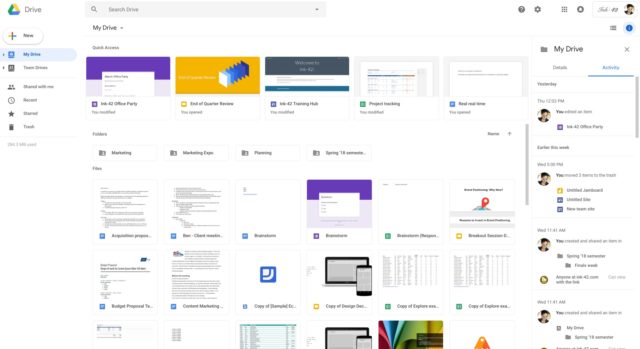
For those who are users of Google Drive, you may or may not have noticed that Google has recently given its cloud storage platform a slight makeover. According to Google, this was done to create a more cohesive look across Google’s services, such as Gmail. “We built that this new interface to create a responsive and efficient experience for Drive users, and to feel cohesive with other G Suite products, such as the recently redesigned Gmail.”
According to Google, “We’re making some updates to the look and feel of Google Drive on the web. There’s no change in functionality, but some icons and buttons have moved, and there’s a range of visual tweaks to align with Google’s latest material design principles.” The changes are not particularly huge and are essentially minor tweaks, but if you haven’t logged in for a while, then these changes more be more apparent.
Filed in . Read more about Google and Google Drive.